Project Goal
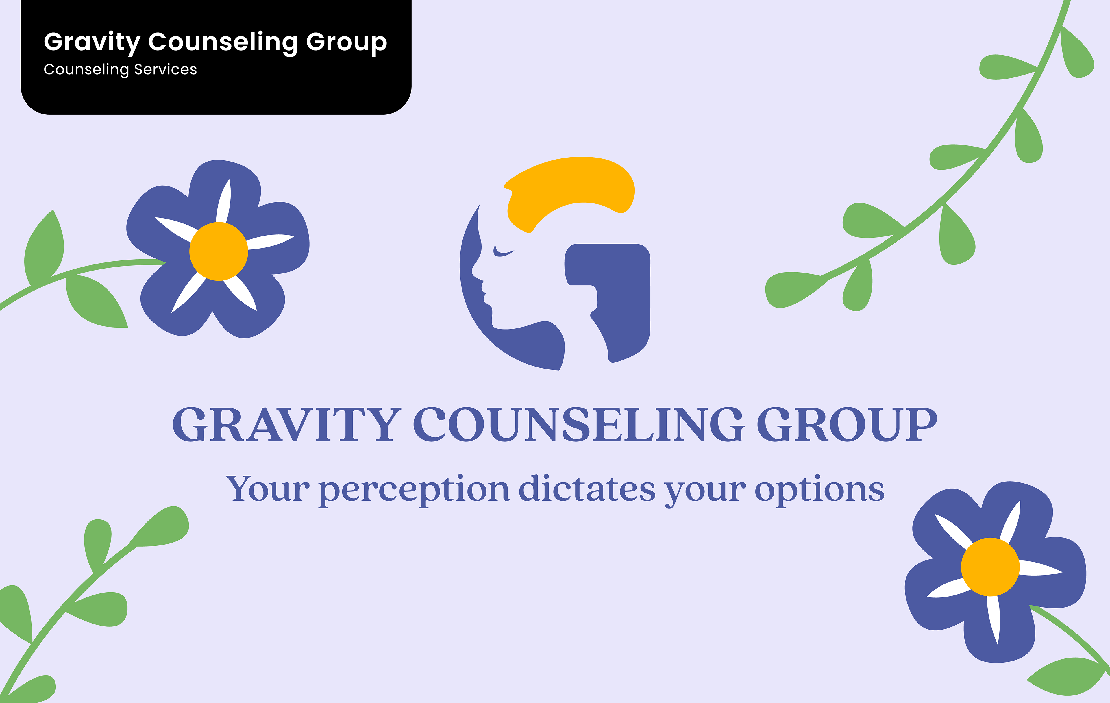
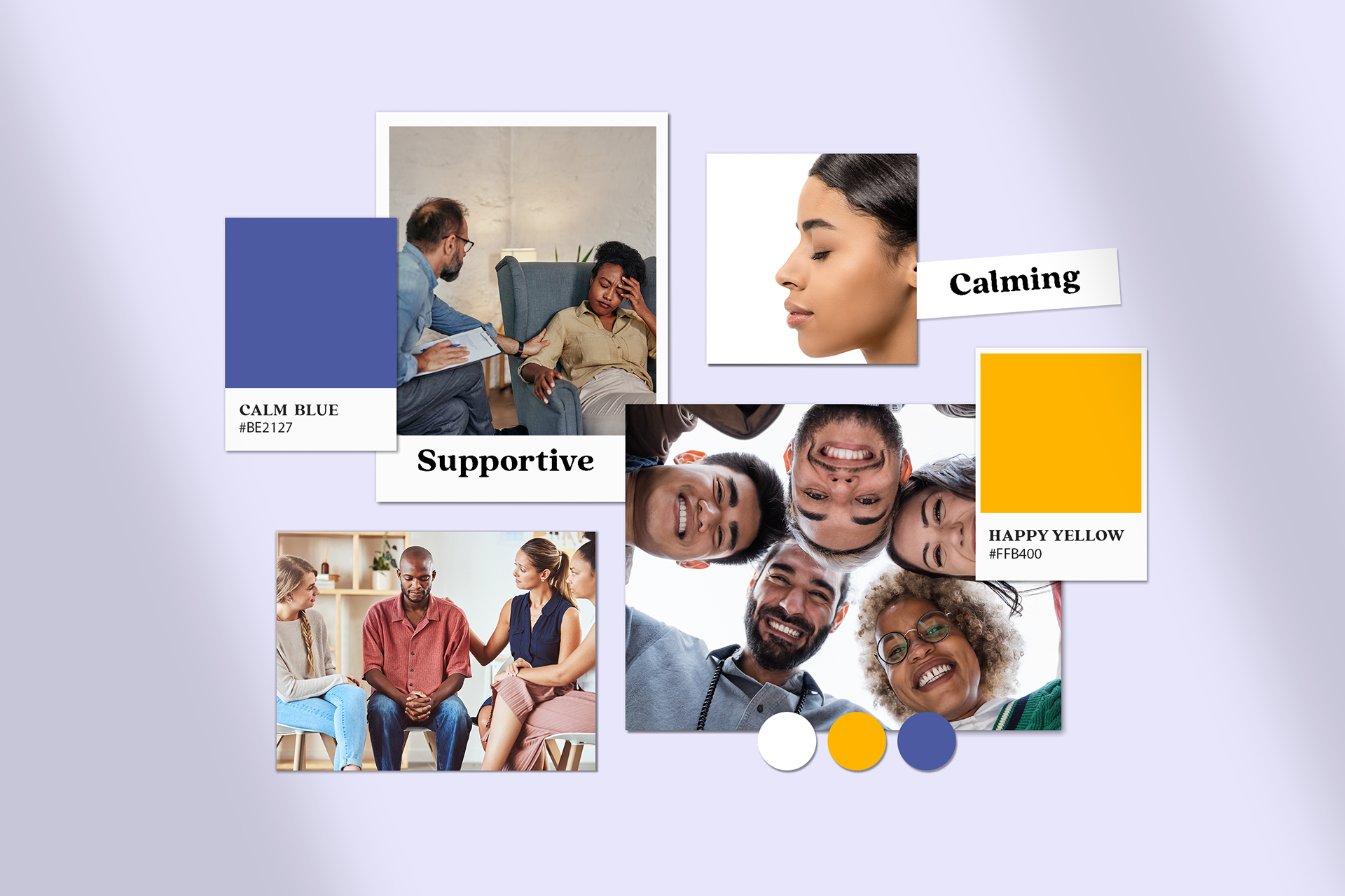
Gravity Counseling provides mental health counseling to couples and individuals dealing with mental illness and life issues. The goal was to depict their brand message through soothing visuals and strategic brand positioning specific to the brands mental health services.
Brand Strategy . Brand Identity

Design Decisions
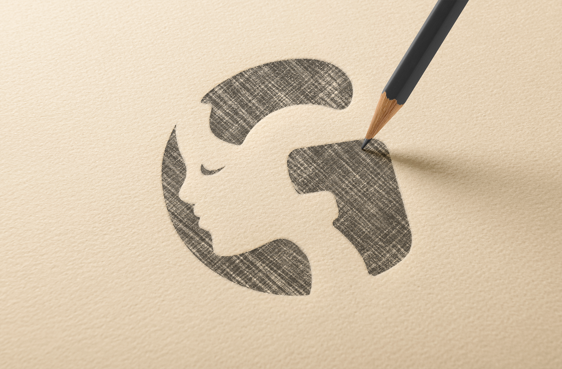
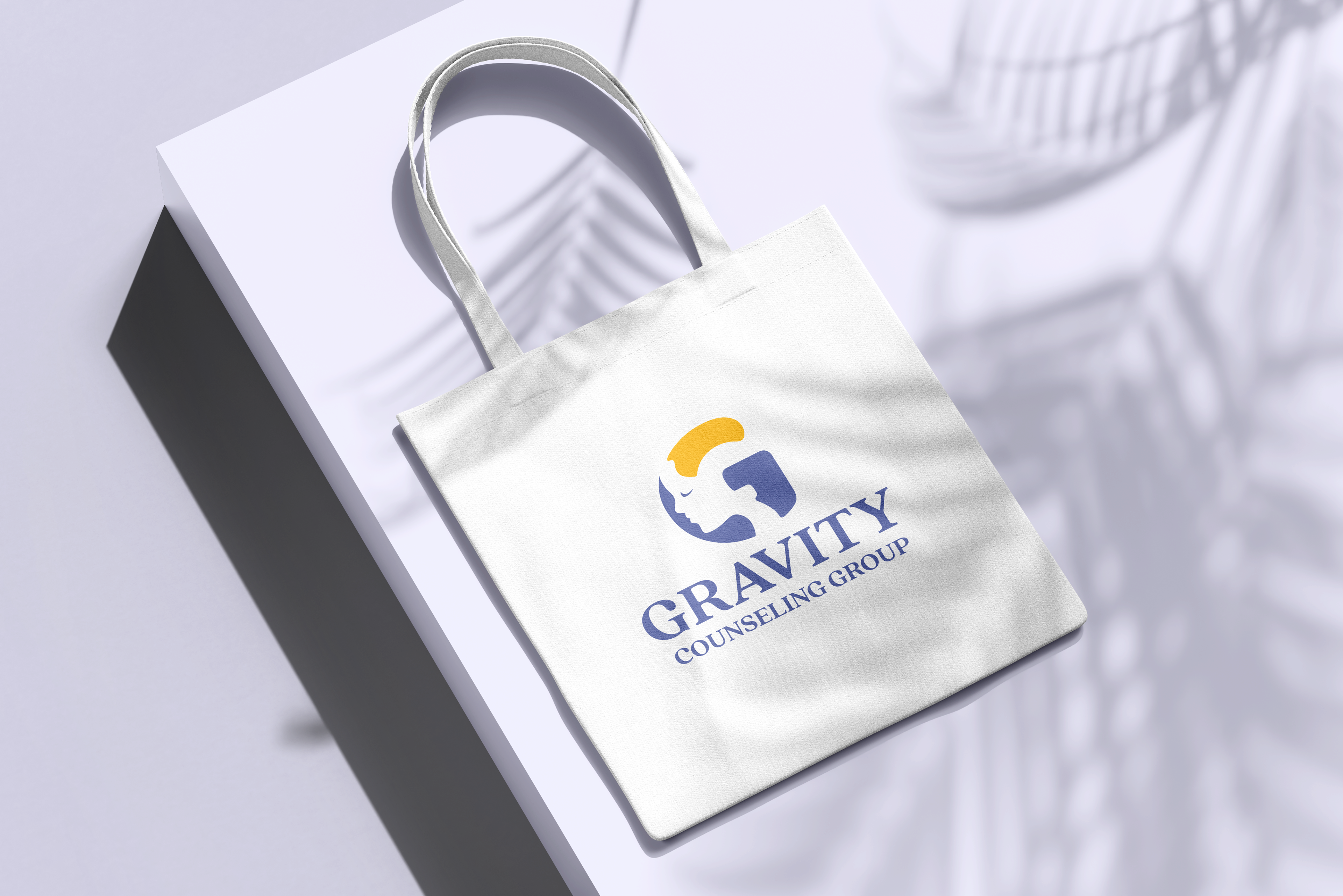
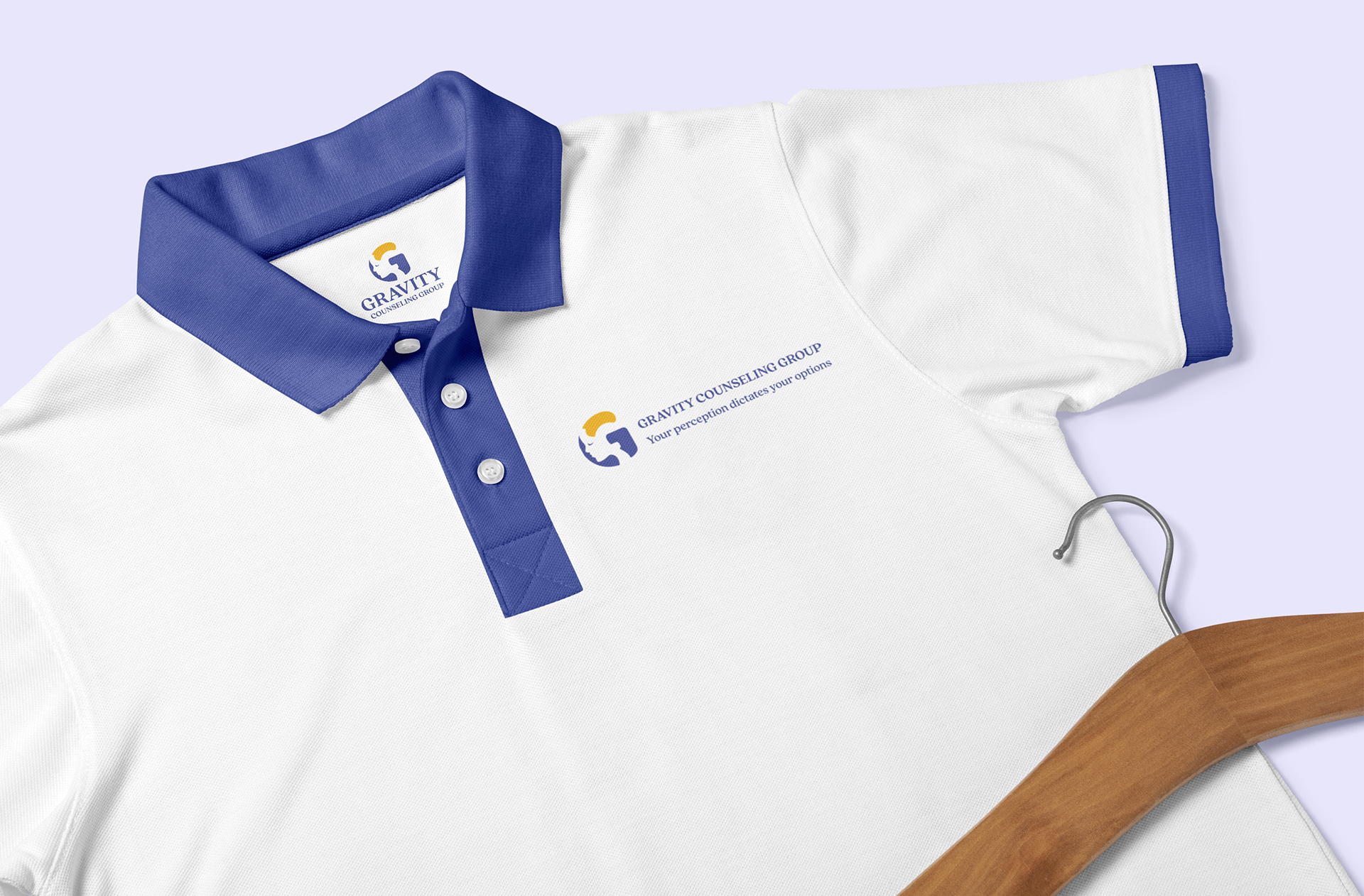
I integrated a calm, expressive face within the letter "G," allowing it to stand alone as a brand symbol while embodying the mission of therapy—helping individuals and relationships find a sense of peace and well-being.
The color palette was chosen to evoke a sense of balance and well-being. Blue symbolizes trust, tranquility, and stability, fostering a calming atmosphere, while yellow adds warmth, optimism, and energy, encouraging a positive and uplifting mindset.